Saturday, June 29, 2013

SIPOC - Suppliers Inputs Process Outputs or Flow chart diagram

SIPOC

From Wikipedia, the free encyclopedia
In process improvement, a SIPOC (sometimes COPIS) is a tool that summarizes the inputs and outputs of one or more processes in table form. The acronym SIPOC stands for suppliers, inputs, process, outputs, and customers which form the columns of the table.[1][2] It was in use at least as early as the Total Quality Management programs of the late 1980s and continues to be used today in Six Sigma and Lean manufacturing.
To emphasize putting the needs of the customer foremost, the tool is sometimes called COPIS and the process information is filled in starting with the customer and working upstream to the supplier.
The SIPOC is often presented at the outset of process improvement efforts such as Kaizen events or during the "define" phase of the DMAIC process.[3] It has three typical uses depending on the audience:
  • To give people who are unfamiliar with a process a high-level overview
  • To reacquaint people whose familiarity with a process has faded or become out-of-date due to process changes
  • To help people in defining a new process
Several aspects of the SIPOC that may not be readily apparent are:
  • Suppliers and customers may be internal or external to the organization that performs the process.
  • Inputs and outputs may be materials, services, or information.
  • The focus is on capturing the set of inputs and outputs rather than the individual steps in the process.[A]


Matrix diagram

Matrix Diagram 
What is it and what does it do?
A Matrix Diagram (MD) is a tool that allows a team to identify the
presence and strengths of relationships between two or more lists of items.
It provides a compact way of representing many-to-many relationships of
varying strengths. An example matrix diagram is shown in figure 1.


Figure 1: An Example Matrix Diagram
Figure 1 shows, by the symbols, the presence of a relationship between the
items in list 1 and the items in list 2. The different symbols indicate the
strength of the relationship and an empty cell indicates no relationship.


Why do it?
Relationships between things are often complex (many-to-many) and
require us to think in more than one-dimension. The Matrix Diagram is a
simple tool that allows relatively complex situations to be analysed in a
simple straightforward way. They help us to expose interactions and
dependencies between things that help us to understand complex causal
relationships.

Where and when to use it?
A Matrix Diagram can be used where we wish to identify and assess the
strength of relationships between to or more lists of items. It is particularly
useful for examining the relationships between:
 a set of vague and un-measurable items with a set of precise and
measurable items (such as relating customer requirements to
technical requirements).
 two sets of items that are physically different (such as design
solutions to a set of technical requirements)
There are five basic types of Matrix Diagrams that allow for different
numbers of lists to be to be explored. The Types are:
 L-type
 T-type
 Y-type
 X-type
 C-type
 QFD Type (Quality Function Deployment)Also called: matrix, matrix chart
The matrix diagram shows the relationship between two, three or four groups of information. It also can give information about the relationship, such as its strength, the roles played by various individuals or measurements.
Six differently shaped matrices are possible: L, T, Y, X, C and roof–shaped, depending on how many groups must be compared.

When to Use Each Matrix Diagram Shape

Table 1 summarizes when to use each type of matrix. Also click on the links below to see an example of each type. In the examples, matrix axes have been shaded to emphasize the letter that gives each matrix its name.
  • An L–shaped matrix relates two groups of items to each other (or one group to itself).
  • A T–shaped matrix relates three groups of items: groups B and C are each related to A. Groups B and C are not related to each other. 

  • This L-shaped matrix summarizes customers’ requirements. The team placed numbers in the boxes to show numerical specifications and used check marks to show choice of packaging. The L-shaped matrix actually forms an upside-down L. This is the most basic and most common matrix format.
     Customer Requirements
    Customer
    D
    Customer
    M
    Customer
    R
    Customer
    T
    Purity %
    > 99.2
    > 99.2
    > 99.4
    > 99.0
    Trace metals (ppm)
    < 5
    < 10
    < 25
    Water (ppm)
    < 10
    < 5
    < 10
    Viscosity (cp)
    20-35
    20-30
    10-50
    15-35
    Color
    < 10
    < 10
    < 15
    < 10
    Drum
    Truck
      
    Railcar
     
  • =======================================================

Prioritization matrix

A Prioritization Matrice can help you decide what to do after key actions, criteria or Critical-To-Quality (CTQ) characteristics have been identified, but their relative importance (priority) is not known with certainty. Prioritization matrices are especially useful if problem-solving resources, such as people, time or money, are limited, or if the identified problem-solving actions or CTQs are strongly interrelated.

To create a matrix, you must judge the relative ability of each possible action to effectively deliver the results you want compared to every other identified action. The product of your work is a weighted ranking of all the possible actions you are considering. The finished matrix can help a team make an overall decision or determine the sequence in which to attack a problem or work toward an objective.

Prioritization matrices are especially useful in the project bounding and analyze phases of Lean Six Sigma quality.

What can it do for you?
You should consider creating a prioritization matrix if:
You cannot do everything at once,
You are uncertain about the best use of your resources or energy or
You are looking toward specific improvement goals.

How do you do it?
Step 1: Agree on the ultimate objective

The first step in applying the Full Analytical Criteria Method is to ensure that the people working on the matrix agree on the ultimate goal they are trying to achieve.
Step 2: List Criteria Needed to Meet the Goal

Next, create a list of criteria or characteristics needed to achieve the goal or meet the objective. (The idea is simply to list the criteria without considering their relative importance. That happens later.) The team can do this by discussion or brainstorming. The purpose is to list all of the criteria that might be applied to all of the options. For example, if the team is considering which improvement step to attack first, some of their criteria might be:
  • Low investment cost
  • Maximum use of existing technology
  • High potential dollar savings
  • High improvement potential for process speed
  • High improvement potential for defect reduction
  • High customer satisfaction potential
  • Minimum impact on other processes
  • Ease of implementation
  • High probability of quick results

Step 3: Compare Relative Importance of Criterion
Once the total list is developed, the next step is to judge the relative importance of each criterion compared to every other criterion. To do that, make an L-shaped matrix with all the criteria listed on both the horizontal and the vertical legs of the L.
Compare the importance of each criterion on the vertical side of the matrix to each criterion listed along the horizontal side using these numeric weightings:
1.0 = The criterion being considered is equally important or equally preferred when judged against the criterion you are comparing it to.
5.0 = The criterion being considered is significantly more important or more preferred.
10.0 = The criterion is extremely more important or more preferred.
0.2 = It is significantly less important or preferred.
0.1 = It is extremely less important or preferred.
Although these specific numeric ratings are to some extent arbitrary, by applying them consistently in a prioritization matrix, you will generate a valid understanding of relative importance. When completing or interpreting the matrix, read across the rows (not down the columns). For example, if criterion a was significantly more important than criterion b, where row a intersects column b write 5. Remember that, if criterion a is significantly more important that criterion b, criterion b must be significantly less important than criterion a. Where row b intersects column a write 0.2.
Continuing in a similar manner, compare each criterion to every other criterion, reach a decision about relative importance, and enter the appropriate values. Do this until the matrix is full. Remember that, whenever you compare two criteria, you should mark the rating where the row of the criterion being compared intersects the column of the criterion you are comparing it to. The inverse of this value should be entered where the column of the criterion being compared intersects the row of the criterion you are comparing it to. That is, you should enter 1 and 1, 5 and 0.2, or 10 and 0.1 for each comparison.
Add the values recorded in each column; then add the column totals to get the grand total.
  
Add the values recorded in each row, then add the row totals to get the grand total. The grand total across the columns should agree with the grand total down the rows. If it does not, check your work. Divide each row total by the grand total. This percentage is the weighting that shows the relative importance of each criterion.


Another example


Interrelationship digraphs

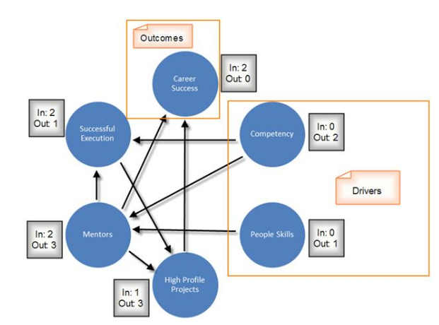
The relations diagram shows cause–and–effect relationships.
Also called: interrelationship diagram or digraph, network diagram

When to Use a Relations Diagram

  • When trying to understand links between ideas or cause–and–effect relationships, such as when trying to identify an area of greatest impact for improvement.
  • When a complex issue is being analyzed for causes.
  • After generating an affinity diagram, cause–and–effect diagram or tree diagram, to more completely explore the relations of ideas.

 Below is a sample inter-relationship digraph for the problem of high no-show rates. The basic steps are as follows:
1. Brainstorm the potential causes of the problem, group similar concepts together,
and label these nodes A, B, C, etc.
2. Identify cause and effect, and draw directional arrows. For example, too much
paperwork (node G) leads to an overworked staff (node D), and consequently an
unfriendly environment for clients and staff (node A). There may be cases when
arrows point both ways, which typically indicates a vicious cycle. Again, if the
problem is too complex, break up the diagram into manageable parts.
3. Count the number of arrows coming into and going out of each node.
These counts determine:
• the root causes —the nodes that have the most number of arrows coming out of them,
• and the key effect, indicators or outcomes —the nodes that have the most number of arrows going into them.

Diagram


PDPC Process decision program charts

The process decision program chart (PDCP) systematically identifies what might go wrong in a plan under development. Countermeasures are developed to prevent or offset those problems. By using PDPC, you can either revise the plan to avoid the problems or be ready with the best response when a problem occurs.

When to Use PDPC

  • Before implementing a plan, especially when the plan is large and complex.
  • When the plan must be completed on schedule.
  • When the price of failure is high.

PDPC Procedure

  1. Obtain or develop a tree diagram of the proposed plan. This should be a high-level diagram showing the objective, a second level of main activities and a third level of broadly defined tasks to accomplish the main activities.
  2. For each task on the third level, brainstorm what could go wrong.
  3. Review all the potential problems and eliminate any that are improbable or whose consequences would be insignificant. Show the problems as a fourth level linked to the tasks.

Nominal group technique

Nominal (meaning in name only) group technique (NGT) is a structured variation of a small-group discussion to
reach consensus. NGT gathers information by asking individuals to respond to questions posed by a moderator, and then asking participants to prioritize the ideas or suggestions of all group members. 
The process prevents the domination of the discussion by a single person, encourages all group members to participate, and results in a set of prioritized solutions or recommendations that represent the group’s  preferences. 
The Four Step Process to Conduct NGT
1.Generating Ideas:
The moderator presents the
question or problem to the group in written form and
reads the question to the group. The moderator directs
everyone to write ideas in brief phrases or statements and
to work silently and in dependently. Each person silently
generates ideas and writes them down.
2.Recording Ideas:
Group members engage in a
round-robin feedback session to concisely record each
idea (without debate at this point). The moderator writes
an idea from a group member on a flip chart that is
visible to the entire group, and proceeds to ask for
another idea from the next group member, and so on.
There is no need to repeat ideas; however, if group
members believe that an idea provides a different
emphasis or variation, feel free to include it. Proceed
until all members’ ideas have been documented.
3.Discussing Ideas:
Each recorded idea is then
discussed to determine clarity and importance. For each
idea, the moderator asks, “Are there any questions or
comments group members would like to make about the
item?” This step provides an opportunity for members to
express their understanding of the logic and the relative
importance of the item. The creator of the idea need not
feel obliged to clarify or explain the item; any member of
the group can play that role.
4.Voting on Ideas:
Individuals vote privately to prioritize the ideas. The votes are tallied to identify the
ideas that are rated highest by the group as a whole.

Scatter diagram


The scatter diagram graphs pairs of numerical data, with one variable on each axis, to look for a relationship between them. If the variables are correlated, the points will fall along a line or curve. The better the correlation, the tighter the points will hug the line.

When to Use a Scatter Diagram

  • When trying to determine whether the two variables are related, such as…
    • When trying to identify potential root causes of problems.
    • After brainstorming causes and effects using a fishbone diagram, to determine objectively whether a particular cause and effect are related.
    • When determining whether two effects that appear to be related both occur with the same cause.

    Scatter Diagram Procedure

    Collect pairs of data where a relationship is suspected.
    Draw a graph with the independent variable on the horizontal axis and the dependent variable on the vertical axis. For each pair of data, put a dot or a symbol where the x-axis value intersects the y-axis value. (If two dots fall together, put them side by side, touching, so that you can see both.)
    Look at the pattern of points to see if a relationship is obvious. If the data clearly form a line or a curve, you may stop. The variables are correlated. You may wish to use regression or correlation analysis now.  

Example:


Variable A = the number of employees trained on new software.
Variable B = the number of bugs identified by users or customers post release into production.
Plot the above for various projects and see there exists a correlation between these 2 variables.You suspect that more training reduces the number of bugs. 


  • Even if the scatter diagram shows a relationship, do not assume that one variable caused the other. Both may be influenced by a third variable.
  • When the data are plotted, the more the diagram resembles a straight line, the stronger the relationship.
  • If a line is not clear, statistics determine whether there is reasonable certainty that a relationship exists. If the statistics say that no relationship exists, the pattern could have occurred by random chance.
  • Think creatively about how to use scatter diagrams to discover a root cause.
  • Drawing a scatter diagram is the first step in looking for a relationship between variables. 
  • Pareto analysis or diagram


    Called: Pareto diagram or Pareto analysis

    A Pareto diagram is a simple bar chart that ranks related measures in decreasing order of occurrence. The principle was developed by Vilfredo Pareto, an Italian economist and sociologist who conducted a study in Europe in the early 1900s on wealth and poverty. 

    He found that wealth was concentrated in the hands of the few and poverty in the hands of the many. The principle is based on the unequal distribution of things in the universe. It is the law of the "significant few versus the trivial many." The significant few things will generally make up 80% of the whole, while the trivial many will make up about 20%.
    The purpose of a Pareto diagram is to separate the significant aspects of a problem from the trivial ones. By graphically separating the aspects of a problem, a team will know where to direct its improvement efforts. Reducing the largest bars identified in the diagram will do more for overall improvement than reducing the smaller ones.

     A Pareto chart is a bar graph. The lengths of the bars represent frequency or cost (time or money), and are arranged with longest bars on the left and the shortest to the right. In this way the chart visually depicts which situations are more significant.

    When to Use a Pareto Chart

    • When analyzing data about the frequency of problems or causes in a process.
    • When there are many problems or causes and you want to focus on the most significant.
    • When analyzing broad causes by looking at their specific components.
    • When communicating with others about your data.
    •  

      Pareto Chart Examples

      Example #1 shows how many customer complaints were received in each of five categories.
      Example #2 takes the largest category, “documents,” from Example #1, breaks it down into six categories of document-related complaints, and shows cumulative values.
      If all complaints cause equal distress to the customer, working on eliminating document-related complaints would have the most impact, and of those, working on quality certificates should be most fruitful.
      Pareto Figure 1
      Example #1
      Pareto Figure 2 
      Example #2


      Example #3
      It is a special vertical chart that is divided into categories which show all possible probabilities or events that can occur. Categories are ordered by the frequency of each category from high frequency on the left side of the vertical axis to low frequency on the right side of it. Pareto depends on the rule of 80/20, which proves that 80/100 of problems comes from 20/100 of causes. So when we know that 20/100 of causes and give more attention and resources to avoid them, we will solve 80/100 of errors and problems. So Pareto Diagram is very useful when we use it with cause and effect diagram (also called Ishikawa or fishbone). The below example shows Pareto Diagram for the reasons that lead to delay in a software project.