The term experiment is defined as the systematic procedure carried out under controlled conditions in order to discover an unknown effect, to test or establish a hypothesis, or to illustrate a known effect. When analyzing a process, experiments are often used to evaluate which process inputs have a significant impact on the process output, and what the target level of those inputs should be to achieve a desired result (output). Experiments can be designed in many different ways to collect this information. Design of Experiments (DOE) is also referred to as Designed Experiments or Experimental Design - all of the terms have the same meaning.
Experimental design can be used at the point of greatest leverage to reduce design costs by speeding up the design process, reducing late engineering design changes, and reducing product material and labor complexity. Designed Experiments are also powerful tools to achieve manufacturing cost savings by minimizing process variation and reducing rework, scrap, and the need for inspection.
Components of Experimental Design
Consider the following diagram of a cake-baking process (Figure 1). There are three aspects of the process that are analyzed by a designed experiment:
Factors, or inputs to the process. Factors can be classified as either controllable or uncontrollable variables. In this case, the controllable factors are the ingredients for the cake and the oven that the cake is baked in. The controllable variables will be referred to throughout the material as factors. Note that the ingredients list was shortened for this example - there could be many other ingredients that have a significant bearing on the end result (oil, water, flavoring, etc). Likewise, there could be other types of factors, such as the mixing method or tools, the sequence of mixing, or even the people involved. People are generally considered a Noise Factor (see the glossary) - an uncontrollable factor that causes variability under normal operating conditions, but we can control it during the experiment using blocking and randomization. Potential factors can be categorized using the Fishbone Chart (Cause & Effect Diagram) available from the Toolbox.
Levels, or settings of each factor in the study. Examples include the oven temperature setting and the particular amounts of sugar, flour, and eggs chosen for evaluation.
Response, or output of the experiment. In the case of cake baking, the taste, consistency, and appearance of the cake are measurable outcomes potentially influenced by the factors and their respective levels. Experimenters often desire to avoid optimizing the process for one response at the expense of another. For this reason, important outcomes are measured and analyzed to determine the factors and their settings that will provide the best overall outcome for the critical-to-quality characteristics - both measurable variables and attributes that can be assessed.
Purpose of Experimentation
Designed experiments have many potential uses in improving processes and products, including:
Comparing Alternatives. In the case of our cake-baking example, we might want to compare the results from two different types of flour. If it turned out that the flour from different vendors was not significant, we could select the lowest-cost vendor. If flour were significant, then we would select the best flour. The experiment(s) should allow us to make an informed decision that evaluates both quality and cost.
Identifying the Significant Inputs (Factors) Affecting an Output (Response) - separating the vital few from the trivial many. We might ask a question: "What are the significant factors beyond flour, eggs, sugar and baking?"
Achieving an Optimal Process Output (Response). "What are the necessary factors, and what are the levels of those factors, to achieve the exact taste and consistency of Mom's chocolate cake?
Reducing Variability. "Can the recipe be changed so it is more likely to always come out the same?"
Minimizing, Maximizing, or Targeting an Output (Response). "How can the cake be made as moist as possible without disintegrating?"
Improving process or product "Robustness" - fitness for use under varying conditions. "Can the factors and their levels (recipe) be modified so the cake will come out nearly the same no matter what type of oven is used?"
Balancing Trade offs when there are multiple Critical to Quality Characteristics (CTQC's) that require optimization. "How do you produce the best tasting cake with the simplest recipe (least number of ingredients) and shortest baking time?"
Benchmarking is the process of comparing one's business processes and performance metrics to industry bests or best practices from other industries. Dimensions typically measured are quality, time and cost. In the process of best practice benchmarking, management identifies the best firms in their industry, or in another industry where similar processes exist, and compares the results and processes of those studied (the "targets") to one's own results and processes. In this way, they learn how well the targets perform and, more importantly, the business processes that explain why these firms are successful.
What is Benchmarking
Benchmarking is the process of determining who is the very best, who sets the standard, and what that standard is. In baseball, you could argue that seven consecutive World Series Championships made the New York Yankees the benchmark.
Once we decide what to benchmark, and how to measure it, the object is to figure out how the winner got to be the best and determine what we have to do to get there.
he check sheet is a form (document) used to collect data in real time at the location where the data is generated. The data it captures can be quantitative or qualitative. When the information is quantitative, the check sheet is sometimes called a tally sheet.[1]
Kaoru Ishikawa identified five uses for check sheets in quality control:[3]
To check the shape of the probability distribution of a process
To quantify defects by type
To quantify defects by location
To quantify defects by cause (machine, worker)
To keep track of the completion of steps in a multistep procedure (in other words, as a checklist)
A Check Sheet is a tool to collect both qualitative and quantitative facts about quality problems. When it is used to collect quantitative data, then known as tally sheet
“A tally sheet that can be used as a checklist when gathering data”
This is an effective tool from one of the 7 basic quality tools, both to prevent and detect problems by having structured valuable data about quality problems.
Differentiating with check list:
Some professional’s gets confused in check sheet and checklist. Check sheet is not a check list, checklist is basically listing of items need to be considered for the purpose of accuracy and completeness.
For example, maintaining a daily to-do task list is a good example of checklist while the check sheet is a collection of facts about a problem categorized by their cause, types, and/or location
Following table further explains the difference between check sheet and checklist:
Check Sheet
Check List
Check sheet conveys information about frequency of problems by type, causes and/or location
The Checklist is used to include all the necessary steps need to follow to ensure the accuracy and completeness of a work product or process. The Checklist can be used while working on a check sheet to ensure its accuracy. For example, what steps need to follow to develop check sheet while collecting real time data
It is normally developed and agreed by the team members as per need of the project. For example sometimes team chooses to develop it to count the frequency for the source of the problem, alternatively team can choose to capture frequency of the data categorised by causes. In other words, check sheet is customized by a team.
For a process, Checklist structure generally comes from the documented standards. Another checklist like to-do list comes from other influences, like someone is preparing to-do list as per expectations set.
These is a tool to record facts about interruptions or problems as a result of a quality control process
This is a tool to record what steps are required to fulfil an objective.
Where It Is Used?
Check sheet is one of the tools from 7 basic quality tools, and used in “Plan Quality” and “Control Quality as a Tool & Technique. Here, my basic objective is to explain the check sheet in the context of these two processes.
While planning a project, past projects document records are used as an input to identify the process improvements to know where sources and causes of defects encountered and where we may need to do efforts to prevent them in the current project. For example, we are using the same team which was involved in the previous project, these factual data can help us to identify how they are collectively executing a process and at what point we can prevent defects in work products.
Like past projects check sheet shows that many defects encountered under category of “misinterpretation of customer requirements” then we may result in a process improvement plan for “Collect Requirements” process. In addition, quality policies in quality management plan and metrics can be designed to measure future work performance and processes.
Check sheet is used as a Tool & Technique in “Control quality process to know about frequencies of problem in a format agreed by the team.
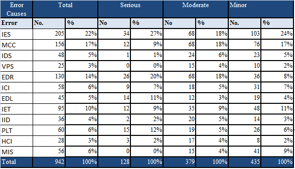
Example Check Sheet
In order to understand the concept I am taking an example that may be used in software project, here I am choosing to show the check sheet in terms of frequencies of quality problems categorized by their causes.
A test team member is evaluating work products to detect problems from the specifications. The team may choose to categorize data about quality problems in following categories:
Categories suggested by Roger S. Pressman:
Incomplete or erroneous specification (IES)
Misinterpretation of customer communication (MCC)
Intentional deviation from specifications (IDS)
Violations of programming standards. (VPS)
Error in data representations (EDR)
Inconsistent component interface (ICI)
Error in design logic (EDL)
Incomplete or erroneous testing (IET)
Inaccurate or inconsistent documentation (IID)
Error in programming language translation of design (PLT)
Ambiguous or inconsistent human/computer interface (HCI)
Miscellaneous (MIS)
While examination of work product test team member, team member assesses the defects and enter the frequencies in their respective category of causes like:
Check Sheet suggested by Roger S. Pressman in software engineering a practitioner’s approach:
Benefits of Check Sheet
Main objective of check sheet is to produce quantitative data about quality problems and use as an input of other seven quality tools like Histogram and Pareto analysis that will be discussed in my upcoming articles.
In addition check sheet is also used to collect qualitative data like no of interruptions that comes from intuition, judgement and feeling of observer.
In short it is an effective tool to collect both quantitative and qualitative data about quality problems.
The Check Sheet is a simple document that is used for collecting data in real time and at the location where the data is generated. The document is typically a blank form that is designed for the quick, easy, and efficient recording of the desired information, which can be either quantitative or qualitative. When the information is quantitative, the check sheet is sometimes called a tally sheet. The check sheet is one of the seven basic tools of quality control made popular by Dr. Kaoru Ishikawa.
Check Sheet used for Plan Quality Management purpose:
While planning a project, past projects document records are used as an input to identify the process improvements to know where sources and causes of defects encountered and where we may need to do efforts to prevent them in the current project. For example, we are using the same team which was involved in the previous project, these factual data can help us to identify how they are collectively executing a process and at what point we can prevent defects in work products.
Like past projects check sheet shows that many defects encountered under category of “misinterpretation of customer requirements” then we may result in a process improvement plan for “Collect Requirements” process. In addition, quality policies in quality management plan and metrics can be designed to measure future work performance and processes.
Check Sheet used for Control Quality purpose:
Check sheet is used as a Tool & Technique in “Control quality process to know about frequencies of problem in a format agreed by the team.
A defining characteristic of a check sheet is that data is recorded by making marks (“checks”) on it. A typical check sheet is divided into regions, and marks made in different regions have different significance. Data is read by observing the location and number of marks on the sheet. Four basic types of check sheets include:
Classification check sheet: A trait such as a defect must be classified into a category. If you just kept track of the total defects, you would know that you had 101 total defects. That is somewhat useful but that, in and of itself, does not provide much insight as to which day is the worst day or which source of defects is in the worst shape, etc. With a classification check sheet, it provides a visual overview of the problem areas.
Defect location check sheet: The physical location of a trait is indicated on a picture, or illustration of a part or item being evaluated. Instead of just keeping track of the number of defects, the defect location check sheet can sometimes reveal an area of the product that tends to see most of the defects. Once this is known, the team can go back to the process to see what it is about the upper right-hand corner of the product that is causing the defects.
Frequency check sheet: The presence or absence of a trait or combination of traits is indicated. Also, number of occurrences of a trait on a part can be indicated. Notice that if you just tracked the number of defects, you may not realize that Wrong Color has the highest frequency of occurrence. Furthermore, if Wrong Color was not broken down further, you might not realize that GREEN is giving you the most defects.
Measurement scale check sheet: A measurement scale is divided into intervals and measurements are indicated by checking an appropriate interval.
What is the difference between Quality Assurance and Quality Control?
✥
ISO 9000 Definitions 1
• Quality Control : “A part of quality management focused on fulfilling quality requirements”.
• Quality Assurance : “A part of quality management focused on providing confidence that quality requirements will be fulfilled.”
✥
Other Definitions 2
• Quality Assurance is defined as “All the planned and systematic activities implemented within the quality system that can be demonstrated to provide confidence that a product or service will ful- fill requirements for quality”.
• Quality Control is defined as “The operational techniques and activities used to fulfill requirements for quality”.
QA is a set of activities for ensuring quality in the processes by which products are developed.
QC is a set of activities for ensuring quality in products. The activities focus on identifying defects in the actual products produced.
Focus on:
QA aims to prevent defects with a focus on the process used to make the product. It is a proactive quality process.
QC aims to identify (and correct) defects in the finished product. Quality control, therefore, is a reactive process.
Goal:
The goal of QA is to improve development and test processes so that defects do not arise when the product is being developed.
The goal of QC is to identify defects after a product is developed and before it's released.
StatisticalTechniques:
Statistical Tools & Techniques can be applied in both QA & QC. When they are applied to processes(process inputs & operational parameters), they are called Statistical Process Control (SPC); & it becomes the part of QA.
When statistical tools & techniquesare applied to finished products (process outputs), they are called as Statistical Quality Control (SQC) & comes under QC.
What:
Prevention of quality problems through planned and systematic activities including documentation.
The activities or techniques used to achieve and maintain the product quality, process and service.
How:
Establish a good quality management system and the assessment of its adequacy & conformance audit of the operation system & the review of the system itself.
Finding & eliminating sources of quality problems through tools & equipment so that customer's requirements are continually met.
Example:
Verification is an example of QA
Validation/Software Testing is an example of QC
Responsibility:
Everyone on the team involved in developing the product is responsible for quality assurance.
Quality control is usually the responsibility of a specific team that tests the product for defects.
The tool is commonly used within project management and allows large numbers of ideas stemming from brainstorming[1] to be sorted into groups, based on their natural relationships, for review and analysis.
Once the cards have been sorted into groups the team may sort large clusters into subgroups for easier management and analysis.[4] Once completed, the affinity diagram may be used to create a cause and effect diagram.[5]
In many cases, the best results tend to be achieved when the activity is completed by a cross-functional team, including key stakeholders. The process requires becoming deeply immersed in the data, which has benefits beyond the tangible deliverables.
AFFINITY DIAGRAM The affinity diagram organizes a large number of ideas into their natural relationships. This method taps a team’s creativity and intuition. It was created in the 1960s by Japanese anthropologist Jiro Kawakita. When to Use an Affinity Diagram When you are confronted with many facts or ideas in apparent chaos When issues seem too large and complex to grasp When group consensus is necessary Typical situations are: After a brainstorming exercise When analyzing verbal data, such as survey results. Affinity Diagram Procedure Materials needed: sticky notes or cards, marking pens, large work surface (wall, table, or floor). Record each idea with a marking pen on a separate sticky note or card. Randomly spread notes on a large work surface so all notes are visible to everyone. The entire team gathers around the notes and participates in the next steps. It is very important that no one talk during this step. Look for ideas that seem to be related in some way. Place them side by side. Repeat until all notes are grouped. It’s okay to have “loners” that don’t seem to fit a group. It’s all right to move a note someone else has already moved. If a note seems to belong in two groups, make a second note. You can talk now. Participants can discuss the shape of the chart, any surprising patterns, and especially reasons for moving controversial notes. A few more changes may be made. When ideas are grouped, select a heading for each group. Look for a note in each grouping that captures the meaning of the group. Place it at the top of the group. If there is no such note, write one. Often it is useful to write or highlight this note in a different color.
An Example from the Hotel Industry
Information about customer wants/needs regarding service and room quality was gathered from several sources. The data before affinitizing are shown below:
In process improvement, a SIPOC (sometimes COPIS) is a tool that summarizes the inputs and outputs of one or more processes in table form. The acronym SIPOC stands for suppliers, inputs, process, outputs, and customers which form the columns of the table.[1][2] It was in use at least as early as the Total Quality Management programs of the late 1980s and continues to be used today in Six Sigma and Lean manufacturing.
To emphasize putting the needs of the customer foremost, the tool is
sometimes called COPIS and the process information is filled in starting
with the customer and working upstream to the supplier.
The SIPOC is often presented at the outset of process improvement efforts such as Kaizen events or during the "define" phase of the DMAIC process.[3] It has three typical uses depending on the audience:
To give people who are unfamiliar with a process a high-level overview
To reacquaint people whose familiarity with a process has faded or become out-of-date due to process changes
To help people in defining a new process
Several aspects of the SIPOC that may not be readily apparent are:
Suppliers and customers may be internal or external to the organization that performs the process.
Inputs and outputs may be materials, services, or information.
The focus is on capturing the set of inputs and outputs rather than the individual steps in the process.[A]
Matrix Diagram
What is it and what does it do?
A Matrix Diagram (MD) is a tool that allows a team to identify the
presence and strengths of relationships between two or more lists of items.
It provides a compact way of representing many-to-many relationships of
varying strengths. An example matrix diagram is shown in figure 1.
Figure 1: An Example Matrix Diagram
Figure 1 shows, by the symbols, the presence of a relationship between the
items in list 1 and the items in list 2. The different symbols indicate the
strength of the relationship and an empty cell indicates no relationship.
Why do it?
Relationships between things are often complex (many-to-many) and
require us to think in more than one-dimension. The Matrix Diagram is a
simple tool that allows relatively complex situations to be analysed in a
simple straightforward way. They help us to expose interactions and
dependencies between things that help us to understand complex causal
relationships.
Where and when to use it?
A Matrix Diagram can be used where we wish to identify and assess the
strength of relationships between to or more lists of items. It is particularly
useful for examining the relationships between:
a set of vague and un-measurable items with a set of precise and
measurable items (such as relating customer requirements to
technical requirements).
two sets of items that are physically different (such as design
solutions to a set of technical requirements)
There are five basic types of Matrix Diagrams that allow for different
numbers of lists to be to be explored. The Types are:
L-type
T-type
Y-type
X-type
C-type
QFD Type (Quality Function Deployment)Also called: matrix, matrix chart
The matrix diagram shows the relationship between two, three or
four groups of information. It also can give information about the
relationship, such as its strength, the roles played by various
individuals or measurements.
Six differently shaped matrices are possible: L, T, Y, X, C and roof–shaped, depending on how many groups must be compared.
When to Use Each Matrix Diagram Shape
Table 1 summarizes when to use each type of matrix. Also click
on the links below to see an example of each type. In the examples,
matrix axes have been shaded to emphasize the letter that gives each
matrix its name.
An L–shaped matrix relates two groups of items to each other (or one group to itself).
A T–shaped matrix relates three groups of items: groups B and C are each related to A. Groups B and C are not related to each other.
This L-shaped matrix summarizes customers’
requirements. The team placed numbers in the boxes to show numerical
specifications and used check marks to show choice of packaging. The
L-shaped matrix actually forms an upside-down L. This is the most basic
and most common matrix format.
A Prioritization Matrice can help you decide what to do after key
actions, criteria or Critical-To-Quality (CTQ) characteristics have been
identified, but their relative importance (priority) is not known with
certainty. Prioritization matrices are especially useful if
problem-solving resources, such as people, time or money, are limited,
or if the identified problem-solving actions or CTQs are strongly
interrelated.
To create a matrix, you must judge the relative ability of each possible action to effectively deliver the results you want compared to every other identified action. The product of your work is a weighted ranking of all the possible actions you are considering. The finished matrix can help a team make an overall decision or determine the sequence in which to attack a problem or work toward an objective.
Prioritization matrices are especially useful in the project bounding and analyze phases of Lean Six Sigma quality.
What can it do for you?
You should consider creating a prioritization matrix if:
You cannot do everything at once,
You are uncertain about the best use of your resources or energy or
You are looking toward specific improvement goals.
How do you do it?
Step 1: Agree on the ultimate objective
The first step in applying the Full Analytical Criteria Method is to
ensure that the people working on the matrix agree on the ultimate goal
they are trying to achieve.
Step 2: List Criteria Needed to Meet the Goal
Next, create a list of criteria or characteristics needed to achieve
the goal or meet the objective. (The idea is simply to list the criteria
without considering their relative importance. That happens later.) The
team can do this by discussion or brainstorming. The purpose is to list
all of the criteria that might be applied to all of the options. For
example, if the team is considering which improvement step to attack
first, some of their criteria might be:
Low investment cost
Maximum use of existing technology
High potential dollar savings
High improvement potential for process speed
High improvement potential for defect reduction
High customer satisfaction potential
Minimum impact on other processes
Ease of implementation
High probability of quick results
Step 3: Compare Relative Importance of Criterion
Once the total list is developed, the next step is to judge the
relative importance of each criterion compared to every other criterion.
To do that, make an L-shaped matrix with all the criteria listed on
both the horizontal and the vertical legs of the L.
Compare the importance of each criterion on the vertical side of the
matrix to each criterion listed along the horizontal side using these
numeric weightings:
1.0 = The criterion being considered is equally important or equally
preferred when judged against the criterion you are comparing it to.
5.0 = The criterion being considered is significantly more important or more preferred.
10.0 = The criterion is extremely more important or more preferred.
0.2 = It is significantly less important or preferred.
0.1 = It is extremely less important or preferred.
Although these specific numeric ratings are to some extent arbitrary,
by applying them consistently in a prioritization matrix, you will
generate a valid understanding of relative importance. When completing
or interpreting the matrix, read across the rows (not down the columns).
For example, if criterion a was significantly more important than
criterion b, where row a intersects column b write 5. Remember that, if
criterion a is significantly more important that criterion b, criterion b
must be significantly less important than criterion a. Where row b
intersects column a write 0.2.
Continuing in a similar manner, compare each criterion to every other
criterion, reach a decision about relative importance, and enter the
appropriate values. Do this until the matrix is full. Remember that,
whenever you compare two criteria, you should mark the rating where the
row of the criterion being compared intersects the column of the
criterion you are comparing it to. The inverse of this value should be
entered where the column of the criterion being compared intersects the
row of the criterion you are comparing it to. That is, you should enter 1
and 1, 5 and 0.2, or 10 and 0.1 for each comparison.
Add the values recorded in each column; then add the column totals to get the grand total.
Add the values recorded in each row, then add the row totals to get the
grand total. The grand total across the columns should agree with the
grand total down the rows. If it does not, check your work. Divide each
row total by the grand total. This percentage is the weighting that
shows the relative importance of each criterion.
The relations diagram shows cause–and–effect relationships.
Also called: interrelationship diagram or digraph, network diagram
When to Use a Relations Diagram
When trying to understand links between ideas or
cause–and–effect relationships, such as when trying to identify an area
of greatest impact for improvement.
When a complex issue is being analyzed for causes.
After generating an affinity diagram, cause–and–effect
diagram or tree diagram, to more completely explore the relations of
ideas.
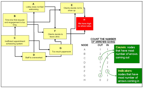
Below is a sample inter-relationship digraph for the problem of high no-show rates. The basic steps are as follows:
1. Brainstorm the potential causes of the problem, group similar concepts together,
and label these nodes A, B, C, etc.
2. Identify cause and effect, and draw directional arrows. For example, too much
paperwork (node G) leads to an overworked staff (node D), and consequently an
unfriendly environment for clients and staff (node A). There may be cases when
arrows point both ways, which typically indicates a vicious cycle. Again, if the
problem is too complex, break up the diagram into manageable parts.
3. Count the number of arrows coming into and going out of each node.
These counts determine:
• the root causes —the nodes that have the most number of arrows coming out of them,
• and the key effect, indicators or outcomes —the nodes that have the most number of arrows going into them.
The process decision program chart (PDCP)
systematically identifies what might go wrong in a plan under
development. Countermeasures are developed to prevent or offset those
problems. By using PDPC, you can either revise the plan to avoid the
problems or be ready with the best response when a problem occurs.
When to Use PDPC
Before implementing a plan, especially when the plan is large and complex.
When the plan must be completed on schedule.
When the price of failure is high.
PDPC Procedure
Obtain or develop a tree diagram
of the proposed plan. This should be a high-level diagram showing the
objective, a second level of main activities and a third level of
broadly defined tasks to accomplish the main activities.
For each task on the third level, brainstorm what could go wrong.
Review all the potential problems and eliminate any that
are improbable or whose consequences would be insignificant. Show the
problems as a fourth level linked to the tasks.